Color is one of the most powerful tools in retail design, yet it's often misunderstood or underutilized. The right color palette can increase brand recognition by 80%, influence purchasing decisions, and create emotional connections with customers. This guide will help you master color theory for retail environments.
Understanding Color Psychology
Colors trigger emotional and psychological responses that influence behavior. In retail, these responses can directly impact sales, dwell time, and brand perception.
Warm Colors: Energy and Excitement
Red: Creates urgency and excitement. Perfect for clearance sales and impulse-buy areas. However, use sparingly—too much red can be overwhelming. Red increases heart rate and creates a sense of urgency, which is why it's commonly used in fast-food restaurants and sale signage.
Orange: Friendly and energetic. Great for calls-to-action and creating a welcoming atmosphere. Orange combines red's energy with yellow's happiness, making it perfect for brands targeting young, active demographics.
Yellow: Optimistic and attention-grabbing. Excellent for window displays and promotional signage. Yellow stimulates mental activity and generates muscle energy, but use it carefully—too much can cause anxiety.
Cool Colors: Trust and Calm
Blue: Evokes trust, security, and professionalism. Ideal for banks, healthcare, and technology retailers. Blue is the most universally liked color and can actually slow down customers, encouraging them to browse longer. It's also associated with productivity and non-invasiveness.
Green: Associated with nature, health, and sustainability. Perfect for organic food stores, wellness retailers, and eco-friendly brands. Green is the easiest color for the eye to process and creates a relaxing environment. It's also strongly associated with money and prosperity in Western cultures.
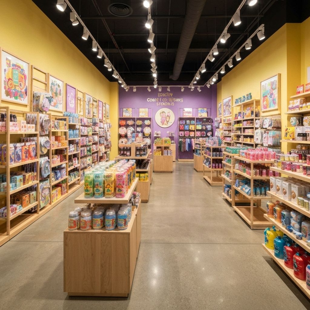
Purple: Represents luxury, creativity, and sophistication. Great for high-end boutiques and creative industries. Purple has historically been associated with royalty and wealth, making it perfect for premium positioning.
Neutral Colors: Foundation and Balance
White: Clean, pure, and minimalist. Creates a sense of space and allows products to stand out. White is perfect for modern, minimalist brands and helps create a premium feel. However, too much white can feel sterile or cold.
Black: Sophisticated, powerful, and elegant. Excellent for luxury brands and creating drama. Black adds weight and seriousness to a space and makes other colors pop. It's the go-to color for high-end fashion and luxury goods.
Gray: Neutral, balanced, and professional. Works well as a background color that doesn't compete with products. Gray is incredibly versatile and can lean warm or cool depending on its undertones.
Brown: Earthy, reliable, and warm. Great for organic, natural, or rustic brands. Brown creates a sense of stability and comfort, making it perfect for home goods and natural products.
Creating Effective Color Schemes
The 60-30-10 Rule
This is the golden rule of color distribution in interior design:
- 60%: Dominant color (usually walls and large surfaces)
- 30%: Secondary color (fixtures, displays, furniture)
- 10%: Accent color (decorative elements, signage, highlights)
This ratio creates visual balance and prevents color overwhelm. Your dominant color should be neutral or subdued, your secondary color can be bolder, and your accent color should be your most vibrant choice.
Monochromatic Schemes
Using different shades, tints, and tones of a single color creates a sophisticated, cohesive look. This approach is safe and elegant but can lack energy if not executed carefully. Add interest through texture, lighting, and varied intensities of your chosen color.
Analogous Schemes
Using colors that sit next to each other on the color wheel (like blue, blue-green, and green) creates harmony and is pleasing to the eye. This approach works well for creating calm, comfortable environments. It's perfect for wellness, spa, and relaxation-focused retail.
Complementary Schemes
Using colors opposite each other on the color wheel (like blue and orange) creates high contrast and visual excitement. This approach is bold and energetic but can be overwhelming if not balanced carefully. Use one color as dominant and the other as an accent.
Triadic Schemes
Using three colors equally spaced on the color wheel creates vibrant, balanced schemes. This approach offers more variety than complementary schemes while maintaining harmony. It's perfect for playful, creative brands targeting younger demographics.
Color and Brand Identity
Your color choices should align with your brand personality:
Luxury Brands
Black, white, gold, deep purple, or navy blue. These colors communicate exclusivity, sophistication, and premium quality. Luxury brands often use minimal color with maximum impact.
Eco-Friendly Brands
Green, brown, beige, and earth tones. These colors communicate natural, sustainable, and organic values. Pair with natural materials like wood and stone for maximum effect.
Tech Brands
Blue, white, gray, and silver. These colors communicate innovation, reliability, and modernity. Clean lines and minimal color palettes work best for tech retail.
Youth-Oriented Brands
Bright, bold colors like hot pink, electric blue, or vibrant yellow. These colors communicate energy, fun, and trendiness. Don't be afraid to use multiple bold colors together.
Health and Wellness
Soft blues, greens, and whites. These colors communicate calm, cleanliness, and health. Avoid harsh or aggressive colors that might create stress.
Practical Application Tips
Start with Neutrals
Use neutral colors (white, gray, beige) for walls and large surfaces. This creates a flexible foundation that won't compete with your products and allows you to change accent colors seasonally without major renovations.
Let Products Shine
If your products are colorful, use neutral backgrounds. If your products are neutral, add color to your environment. The goal is to create contrast that makes products stand out.
Consider Lighting
Colors look different under different lighting conditions. Always test your color choices under your actual store lighting before committing. Natural light, warm LED, and cool LED will all make colors appear different.
Cultural Considerations
Color meanings vary across cultures. If you serve a diverse customer base or plan to expand internationally, research color associations in your target markets. For example, white represents purity in Western cultures but mourning in some Eastern cultures.
Seasonal Adjustments
Consider changing accent colors seasonally to keep your space fresh and relevant. This doesn't require major renovations—simply swap out decorative elements, signage, and small fixtures in seasonal colors.
Common Color Mistakes to Avoid
- Too Many Colors: Stick to 3-4 colors maximum. More creates visual chaos.
- Ignoring Undertones: Pay attention to warm vs. cool undertones. Mixing them carelessly creates discord.
- Following Trends Blindly: Trendy colors date quickly. Choose timeless colors for permanent elements.
- Forgetting About Products: Your color scheme should complement, not compete with, your merchandise.
- Inconsistent Application: Use your colors consistently throughout the space for cohesion.
Testing Your Color Scheme
Before committing to a full implementation:
- Create a mood board with your proposed colors
- Test paint samples on actual walls under your lighting
- Get feedback from team members and trusted customers
- Consider how colors will photograph (important for social media)
- Think about how colors will look with your products
Using AI Tools for Color Selection
Modern AI design tools can help you:
- Generate color palettes based on your brand and industry
- Visualize how colors will look in your actual space
- Test multiple color schemes quickly
- Ensure color harmony and balance
- Get data-driven recommendations based on successful retail designs
Conclusion
Color is a powerful tool that can make or break your retail environment. By understanding color psychology, creating balanced color schemes, and aligning your choices with your brand identity, you can create spaces that not only look beautiful but also drive customer behavior and sales.
Remember: there are no universally "right" colors—only colors that are right for your specific brand, products, and customers. Use the principles in this guide as a foundation, but don't be afraid to experiment and find what works best for your unique retail environment.